Blog
Blog

Table of Contents
What is the Customer Experience?
Customer experience is defined as the customers’ perceptions of their relationship with your brand and particularly considers the direct and indirect contact with your business (i.e. “touch points”). These touch points can refer to service interactions, such as the handshake of a sales agent, the complexity of a mobile phone contract, or the steps that a customer needs to undergo to complete a rebate on a faulty product.
They can also refer to designed aesthetic, ergonomic, and societal aspects of a product, such as the sound of a Harley Davidson motorbike, Apple’s origami-like sensory experience of their product packaging, or the well-oiled mechanical feel of the buttons of a Leica camera that communicate the product’s reliability and endurance.
The quality of these interactions leave an impression on the customer on whether their experience lives up to the fundamental value proposition of your brand.
Successful brands embed their fundamental value proposition as a design criterion in their service or product offerings. A best practice example in e-commerce is the online marketing strategy of KLM Royal Dutch Airlines.
They differentiate themselves from other airlines by viewing themselves as an organization that creates memorable experiences for their customers, with a focus on the individual behind the customer. This fundamental value proposition is enshrined in their slogan “Journeys of Inspiration” and is extensively used as a design criterion throughout the customer journey.
Transformative, or life-changing travel experiences are at the center of KLM’s customer acquisition strategy. These narratives form the basis for their shareable social media content, newsletter emails, and personalized offers. Their focus on the individual behind the customer brought them to a unique sales strategy that offers their customers a combination of a generic, responsive airline e-commerce website and the option to book flights by sending a message to KLM on Facebook and Twitter.
Customer service inquiries are also processed using these social media channels, reflecting ease of use, timeliness, and regard for individual needs.
As a result, KLM not only managed to shift their image from a legacy airline to a customer experience innovator using this online marketing strategy, their social media customer service operation generates 25 million euro per year in sales.

Why is it Relevant for E-Commerce SMEs?
A well-thought-out fundamental value proposition is however not entirely necessary to give an impression of reliability, confidence, and clarity. Objections that customers might have during their online store visit can readily be taken away by thoughtfully re-designing its touch points. In turn, this will have an immediate and positive impact on your conversion rates and revenue figures.
Not only is good practice design a critical anchor for achieving optimal conversion rates; it also improves the ratio between the Customer Acquisition Cost (CAC) and the Customer Lifetime Value (LTV).
Customer Acquisition Cost is the cost associated with convincing a customer to buy a product or service and is usually incurred by investments in a marketing and advertising strategy. If a business spent 10,000 euro on marketing in a given year and acquires 1,000 customers in that year, then the CAC is 10 euro.
This investment of 10 euro to have a customer, however, does not yet guarantee a profitable return. Such returns can be estimated by calculating the customer’s Lifetime Value. This formula consists of several key metrics, such as the average order value, average gross margin, and the retention rate. Each of these metrics can be tweaked by re-designing the critical touch points in the customer journey.
Offering volume discounts and free shipping above a given order value motivate customers to add more items to their carts. Striking a balance between offering discounts and highlighting best value deals can improve the average gross margin. Last, but not least, a responsive online store with an efficient checkout process will contribute to the customer’s confidence in your business, which in turn improves conversion and retention rates.
Identifying Touchpoints by Mapping the E-Commerce User Flow
Touchpoints are the low hanging fruits of conversion rate optimization and often require nothing more than a quick fix in their appearance. But how do you identify the touchpoints that benefit the most from such improvements?
Online stores are designed with a particular user flow in mind and are generally structured over five key stages: site landing, product discovery, product presentation, cart management, and check out. User flows describe the customer’s practical use of the online store, whereas the customer journey is the complete sum of experiences that customers go through when interacting with your company and brand.
Exponea allows you to monitor the conversion rates throughout the user flow stages by tracking the browsing behavior of your customers. The chart below shows an example outcome.
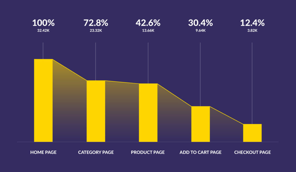
As expected, the conversion rates taper off along the sales funnel. In the case of this online store, there are also significant drops in the conversion from site landing to product discovery, and from cart management to check out. From the perspective of the customer experience, these drops indicate that almost 30% of the visitors don’t feel particularly inclined to further explore the online store’s offers and that 70% of the potential buyers abandon their carts.
Even though a drop of 30% at the start of the funnel initially might not raise a big concern, it might be the case that similar issues in the customer experience cause 70% of the potential buyers not to close the deal. Redesigning these critical touchpoints eliminate the overt, readily fixable issues, and may uncover deeper underlying root causes that lead to such conversion rates. These may include bad server connections or uncompetitive pricing strategies.
Touchpoint Optimization Strategies
Does your online store have a look and feel that is empathetic to the workings of the real world?
There are many examples of good practice designs readily available in your immediate environment.
Critical kitchen appliances, such as cooktops, tend to follow a “form follows function” design principle: the placement of the knobs intend to provide clarity and safety during cooking activities, a moment where people depend on their intuition rather than being preoccupied with the logic of complex machines. How cluttered is your online store? Are there objects and functions that distract your customer from making the purchase?
If you walk up the street, you’re likely to come across a traffic light in your area. Traffic lights signal travelers to stop until a signal to proceed is given. A red light indicates “stop” and a green light indicates “go”. The association of these signals with their respective actions are deeply ingrained in our culture. Red and green signals are also extensively used in electrical appliances such as televisions, where red means “standby” and green means “on”. By that logic, what is the color of your online store’s “Add to Cart” buttons, and what would this color imply as a signal?
Now, what if you’re waiting for the red light to turn green, there’s no traffic passing through, and a group of pedestrians crosses the street regardless of the red light? Would you be inclined to join them and cross the street too? If you couldn’t resist the temptation to cross the street, then you’ve been led by a psychological mechanism called social proof; an individual’s belief that the group is better informed than they are.
Would there be methods to bring this experience to your online store?
Across the street, we’ll find a supermarket. The smell of a fresh bakery and the sight of flowers and fresh produce greet us when we enter the establishment, all intended to put you in a good mood. The supermarket shelves are located right behind this display of fresh produce. The items on these shelves are carefully organized to maximize sales.
“Eye level is buy level”, a common phrase used by supermarket operators. Products with high margins, often branded, are located at eye level or just below. Supermarkets also cross-sell goods by grouping particular product categories together. For instance, beer and potato chips are often placed in the same aisle with the aim to sell you more items than the ones you initially wanted to buy. Would there be placement and cross-selling tactics that can increase an online store’s gross margin and average order value?
The questions at the end of the preceding paragraphs are, of course, rhetorical. There are indeed many methods that optimize your online store in a likewise manner to the real world examples you see around you.
How Cluttered is Your Online Store?
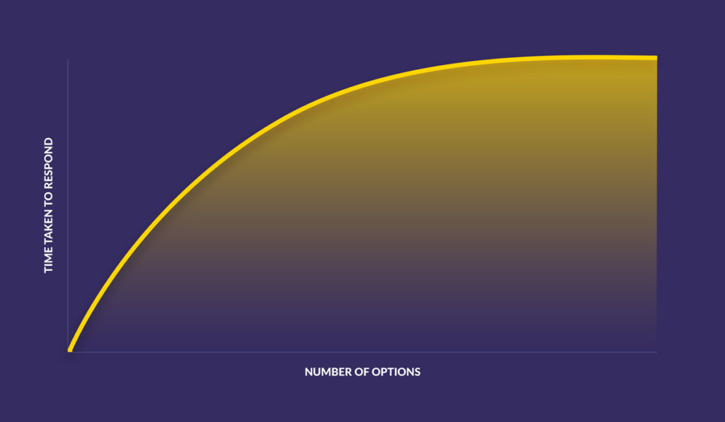
Ensuring that your online store looks clean, well-organized, and focused on its bottom line eliminates potential choice paralysis. This is a state in which visitors have a difficult time making a decision when faced with too many options. Research conducted by psychologists William Hicks and Ray Hyman demonstrate that the decision time increases as the number of options go up. Our visitor behavior analyses also point out that visitors tend to give up if they feel overwhelmed with choices.
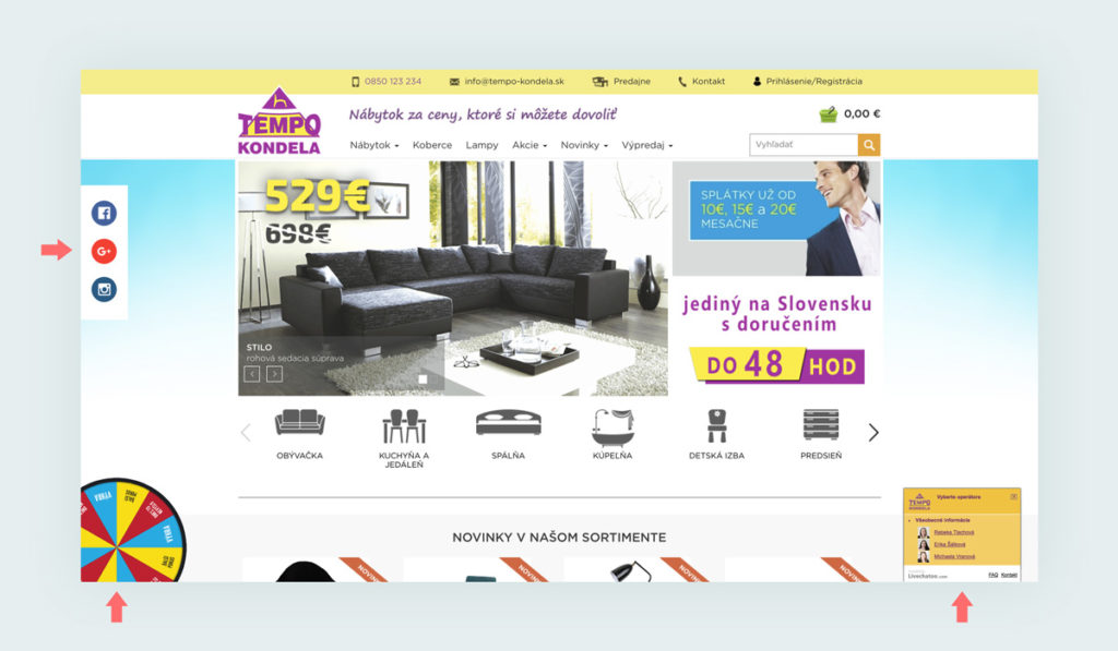
We have optimized online stores that presented options unrelated to the visitor’s intent of shopping for goods or services. These options include social media buttons, games to win discount vouchers, and customer service request buttons. Once these options were left out, the number of visitors extensively browsing the store increased by 15% on average.
What are the Colors of Your CTA Buttons?
Understanding the colors of your online store’s attributes as signals will help you enhance its conversion potential. Colors are symbols that indicate a particular mood or state. Red signifies a warning, excitement, or danger. Green signifies vitality, safety, and harmony.
On the other hand, they also help us to identify a web page’s actionable features: a green CTA button would be difficult to locate if the same color dominates the page. A red CTA button would work better in this case, because it offers the maximum amount of contrast against a green background. It is therefore essential to consider the overall color scheme of your online store: how does it impact your brand, fundamental value proposition, and user flow?
Our consultants came across numerous opportunities to adjust the colors of our client’s CTA buttons, which in and of itself led to an average increase in RPV of 6.5%
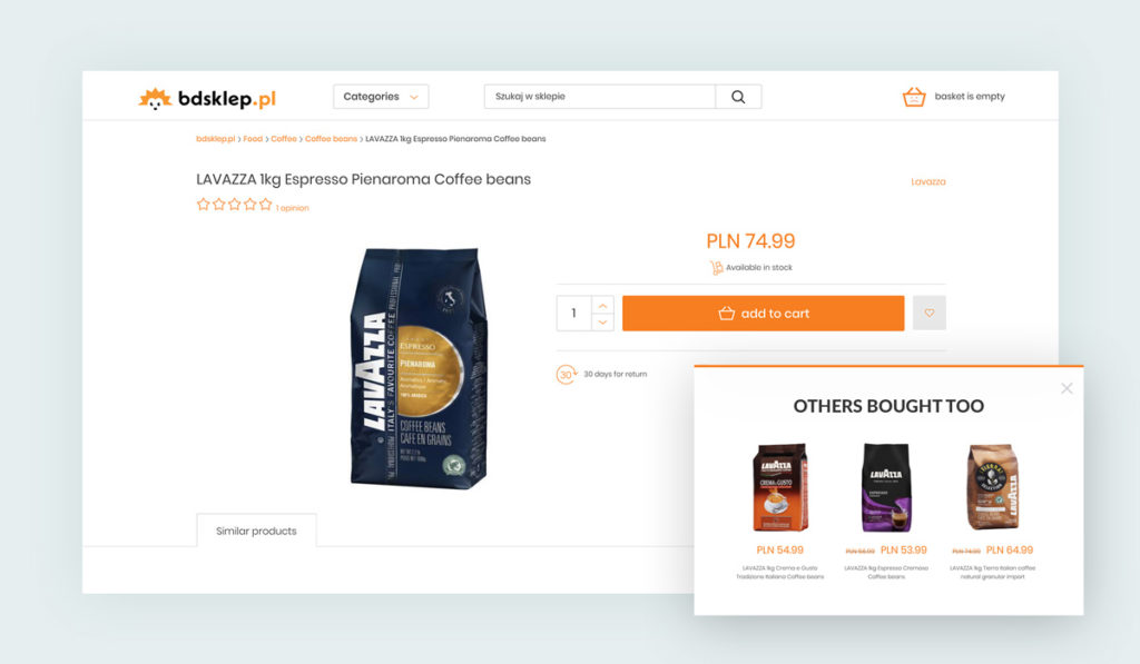
Would There Be Methods That Bring Social Proof to Your Online Store?
Brick-and-mortar store operators are well aware that the number of customers who gather around a product increases its desirability. A View Count Banner is able to convey this type of social proof in an online store.
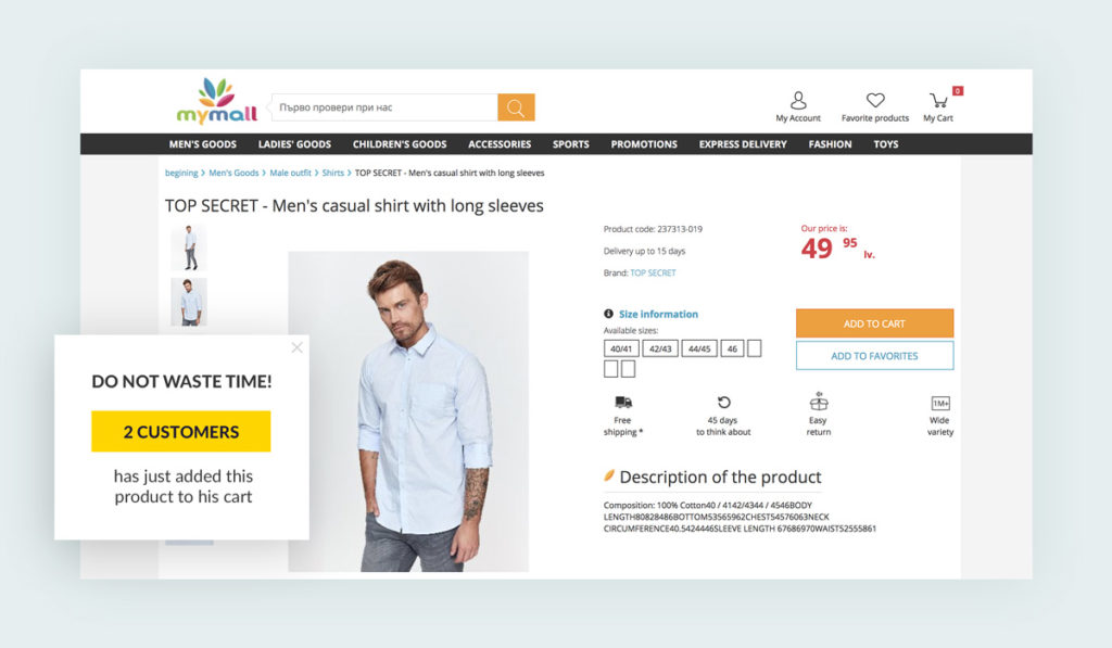
We researched three variants of the View Count Banner, each depicting how many customers were either viewing, have purchased, or have added the product to their carts. Potential buyers were the most sensitive to the number of customers who bought the product. Our clients reported an average increase in RPV by 71.5% after using View Count Banners in their online stores.
Are There Any Cross-Selling Techniques That are Suitable for Online Stores?
Whereas the supermarkets’ cross-selling techniques are limited to placing complementary goods at a hand’s reach, online stores don’t have such physical constraints when upselling goods to the customer. The Cross-sell Banner is an effective method for presenting shopping suggestions that are relevant to the customer. These suggestions can be based on the customer’s last seen items, brand interest, or collaborative filtering. Cross-sell Banners based on collaborative filtering yield an average increase in RPV of 67%
Conclusion
A good customer experience assures visitors of your security, reliability, and trustworthiness. By asking whether your online store has a look and feel that resonates with people’s everyday experiences can already yield numerous opportunities for further consideration. The resulting enhancements to the customer experience often lead to significant increases in revenue. Once implemented, these enhancements can open up new avenues in marketing automation, such as personalized shopping experiences and improving the customer lifetime value by messaging the right customer with the right message at the right time.
Want more? We’ve got you covered
What Should You Read Next? Author's Hand-Picked Recommendation:
Your Customers Want an Experience. Give it to Them.
86% of customers are willing to pay more for a better customer experience. Give them what they want.